
:quality(80):no_upscale())

Pio
Industrial Design
AI product photography, lifestyle scenes, and video for ecommerce catalogs
15.2MB · 9,893px tall · uses Arial, Sf Pro Display
Industry
Ecommerce Retail, Productivity
Style
Minimal, Typographic, Gradient
Stage
Private
Built with
Webflow

About the site
Fourmula generates studio-quality product shots, lifestyle scenes, and campaign video from a brand's existing catalog. The landing page is gallery-like: a ring of rounded model and product photos orbits an upload box in an almost empty white hero, with a two-tone headline, 'Your catalog, instantly re-shot', anchored bottom left. The four-step process then breaks the calm with vivid orange, teal, blue, and red gradient bands. A strong reference for AI creative tools that let their output do the talking.
For ecommerce teams tired of booking shoots: the page is the output, with one flat jacket photo turned into a full shoot.
Primary navigation
ClickTap a section to see it on the page
A ring of model and product photos orbiting an 'Upload or drop your assets' box, over 'Your catalog, instantly re-shot.' with the second line in grey, and an Awwwards Site of the Day ribbon.
Why it converts: The upload box sits where a headline usually would, so the eye lands on the action first, and the orbiting photos are the output being promised.
'On-brand visuals. Made by AI.' set huge on its own under a small 'What you can do' label.
Why it converts: 'On-brand' comes before 'AI' on purpose: brand teams fear generic AI imagery more than they value speed.
One flat photo of a '4M' jacket, an arrow, then nine generated shots of models wearing it in studio and street settings: 'Studio-quality, without the studio.'
Why it converts: Before-and-after is the most persuasive format for a generation tool. The buyer sees their exact problem, one product shot that needs to become ten, solved in a single frame.
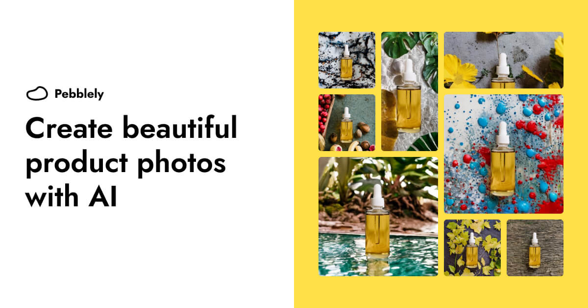
Two more cards: perfume and skincare bottles placed into styled scenes ('Your product, new scenes on demand') and 'Campaign-ready video in minutes' for Reels and TikTok.
Why it converts: Stills, scenes and video in one tool replace several suppliers, which is the budget argument a brand lead needs to switch.
Attentive, Yotpo and Gorgias in grey tiles under a small 'Trusted by' label.
Why it converts: Ecommerce platforms the buyer already runs vouch that the tool fits their stack.
'From idea to assets in four steps', each a full-width gradient band (orange, teal, violet, red) with a giant numeral: add products, AI generates, choose the best, export.
Why it converts: Big numbered bands make the workflow feel short and finite, and a Get started button in every band lets the reader act at whichever step convinced them.
'Not AI-gen answers. Real ones here.' over questions like 'Will the visuals match our brand look?', 'Do I own the assets you generate?' and 'Does this replace my creative team?'
Why it converts: The headline jokes about its own category to earn trust, and the questions are the three that stall a brand team: quality, rights and internal politics.


