


Griffin
Fintech
Loan management and servicing platform for B2B lending programs
3.6MB · 15,603px tall · uses __opensauce_39fbf1, alliancemono
Industry
Fintech, Capital Finance
Style
Minimal, Typographic
Stage
Series A
Built with
Next.js, WordPress
About the site
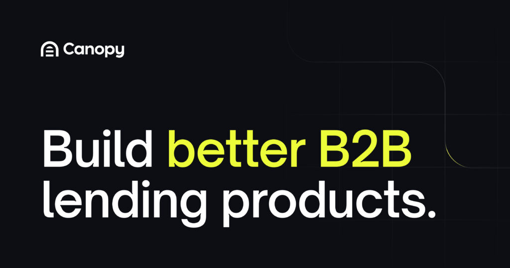
Canopy is a loan management and servicing platform for lenders, fintechs, and vertical SaaS companies building credit products. The landing page opens with an oversized black headline where 'Build better' and 'B2B' sit in faint outlined boxes, as if placed on a design canvas, over a crosshair grid. A calm white page documents each module with clean screenshots. A useful reference for fintech infrastructure and API-first products.
For lending product teams at fintechs: a module-by-module tour of real servicing screens, each led by a one-line benefit.
Primary navigation
ClickTap a section to see it on the page
'Build better B2B lending products.' with 'B2B' in an outlined box as if selected on a design canvas, over a crosshair grid, under a '[2025 Guide] How to Build a Thriving B2B Loan Program' pill.
Why it converts: Boxing 'B2B' says who it's for before the sub-headline does, and the guide pill offers a lower-commitment first step to buyers still researching.
A strip of mixed cards under the buttons: a $1,844.46 balance widget, a collateral table with valuation types, and a photo of a smiling borrower.
Why it converts: Ledger UI next to a real borrower shows both sides of servicing, the operator's precision and the customer's experience, in one glance.
Novo, Mercury, Measured, Flexport, Prime and Tandym in one row, straight under the product strip.
Why it converts: Mercury and Flexport are the names a fintech PM wants to be compared with. Putting them this high makes Canopy look like the proven choice, not the risky one.
'A loan management system. And so much more.' with the second line in grey, leading into dark cards such as 'Build lending products that last.'
Why it converts: The grey second line lifts a commodity category into a platform, so the reader stops comparing Canopy with legacy servicing software.
'One home for operating and scaling lending products. However complex.' with the last two words in grey and a single Explore our platform link.
Why it converts: 'However complex' speaks to the buyer's real fear, that their unusual loan product won't fit, and promises it will before the tour begins.
Six module cards (Collateral Management, Canopy Connect, DataDirect, LoanLab, Preview, SafeGuard) beside a sticky index, each opening on a bold line like 'Drop manual work.' above real UI.
Why it converts: Leading every card with the outcome in bold means a skimmer gets the pitch from six phrases, and the real screens back each one up.
'Embed modern lending and credit products, whether you're a fintech, digital bank, or vertical SaaS company', with an Explore use cases link.
Why it converts: Naming three buyer types lets each reader place themselves, and the use-case link routes them to a page about their exact business model.
'Trusted by modern lending teams' over a large Flexport + Canopy card tagged Installment and Logistics Financing: 'How Flexport leveraged Canopy to scale its lending program'.
Why it converts: A logistics giant running installment lending on Canopy proves it handles real volume, the question that stalls most fintech infrastructure deals.
A dark card, 'Create flexible lending products. With less work.' with the last phrase in lime, pitching a low-code API and linking to Canopy Docs.
Why it converts: Engineering often decides whether an LMS gets adopted. Speaking to them directly, with docs one click away, lets the champion pull their team in early.
'Card issuers. Payments processors. Credit reporting. Whoever you're partnered with, Canopy connects.' over a numbered grid: Checkout.com, Dwolla, Modern Treasury, Stripe, Galileo, Square.
Why it converts: Lenders are tied to existing processors. Seeing theirs in the grid removes the fear that switching servicing means switching partners too.
'Your next lending product awaits' on deep navy with a lime Get started button, then PCI-DSS and AICPA SOC badges in the footer.
Why it converts: The close points at the next product, not the current one, inviting a forward-looking conversation, and the badges clear compliance as the reader decides.


